Tag: CSS

PHP Upload Multiple Files From URL

In a previous post I made I showed you how to upload a file from a URL using a PHP script. You can view this post here.

Now I will show you how to take this a step further and upload multiple files from multiple URLs or uploaded from the user’s computer.

Because we will have multiple files to upload we are going to want to make an array of these files that include all their attributes. Then we’ll process each file at a time and based on whether it is coming from a URL or the user’s hard drive, we will upload it accordingly.

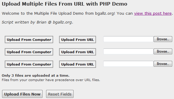
Here is a preview of what our form will look like:
Here is our HTML for this form on index.php:

<form action="./index.php?do=upload" method="post" enctype="multipart/form-data" name="upload_files_form">
<div id="upload_files">
<div id="upload_file_1">
<div>
<button id="1_computer_button" name="upload_type_computer" type="button" onclick="hideElement('1_upload_url'); showElement('1_upload_computer')">Upload From Computer</button>
<button id="1_url_button" name="upload_type_url" type="button" onclick="hideElement('1_upload_computer'); showElement('1_upload_url')">Upload From URL</button>
</div>
<div>
<div id="1_upload_computer">
<input type="file" name="files_hdd[]" size="30" />
</div>
<div id="1_upload_url" style="display:none">
<input type="text" name="files_url[]" size="30" maxlength="100" value="http://" onfocus="if(this.value == 'http://') this.value = '';" id="1_input_url" />
</div>
</div>
</div>
<div id="upload_file_2">
<div>
<button id="2_computer_button" name="upload_type_computer" type="button" onclick="hideElement('2_upload_url'); showElement('2_upload_computer')">Upload From Computer</button>
<button id="2_url_button" name="upload_type_url" type="button" onclick="hideElement('2_upload_computer'); showElement('2_upload_url')">Upload From URL</button>
</div>
<div>
<div id="2_upload_computer">
<input type="file" name="files_hdd[]" size="30" />
</div>
<div id="2_upload_url" style="display:none">
<input type="text" name="files_url[]" size="30" maxlength="100" value="http://" onfocus="if(this.value == 'http://') this.value = '';" id="2_input_url" />
</div>
</div>
</div>
<div id="upload_file_3">
<div>
<button id="3_computer_button" name="upload_type_computer" type="button" onclick="hideElement('3_upload_url'); showElement('3_upload_computer')">Upload From Computer</button>
<button id="3_url_button" name="upload_type_url" type="button" onclick="hideElement('3_upload_computer'); showElement('3_upload_url')">Upload From URL</button>
</div>
<div>
<div id="3_upload_computer">
<input type="file" name="files_hdd[]" size="30" />
</div>
<div id="3_upload_url" style="display:none">
<input type="text" name="files_url[]" size="30" maxlength="100" value="http://" onfocus="if(this.value == 'http://') this.value = '';" id="3_input_url" />
</div>
</div>
</div>
</div>
<input type="submit" name="submit" value="Upload Files Now" onclick="showUploadDiv()" />  <input type="reset" name="reset" value="Reset Fields" />
<p> </p>
<div id="uploading" style="display:none">
</div>
</form>

This form contains three file inputs, either uploaded from the user’s computer, or given by a URL to a file. There are two buttons for each input which enable and disable the HDD or URL upload options. Now, I haven’t made the script to completely disable the URL input once a file has been selected from the user’s computer, so when the form is submitted it will check for uploaded files first over files being gathered from a URL. So you will want to include that on your main page so users know you can only upload three files at a time here, not six.

The form includes the animated loading gif feature which I posted here:
https://bgallz.dev/1140/how-to-make-animated-loading-gif/

You’ll notice on the submit button it activates the Javascript function “showUploadDiv().” This function changes the display style setting on the uploading div and then fills it with some text and the animated loading image.

I also have used some jQuery for the buttons to be used effectively:

<script src="jquery-1.7.2.min.js" type="text/javascript"></script>
<script type="text/javascript">
$(document).ready(function(){
var clickedClass = "selected";
var buttons = "#upload_files button";
$(buttons).click(function() {
$(this).addClass(clickedClass).siblings().removeClass(clickedClass);
});
});
</script>

What this jQuery says is to add the class “selected” – from clickedClass – to the current button that is being clicked, and remove that class name from all other buttons within the current parent’s sibilings. Sounds a little complicated, but it’s very simple. The buttons are loaded from “#upload_files button” – so thats all the button elements within the div ID “upload_files.”

Now finally for the PHP of the script. On index.php we include the following in the header:

$valid_exts = array(
"gif","png","jpeg","jpg",
"image/gif","image/jpeg","image/png","image/jpg"
); // array of valid file extensions
$max_file_size = 32; // file size in kb
$upload_dir = "files/"; // directory to upload to with trailing slash

$upload_result = "";

if(isset($_GET['do']) && $_GET['do'] == "upload"){
$upload_result = run_upload_form();
}

So when the form is submitted – which is sent to “index.php?do=upload” – we run the function run_upload_form() and set the $upload_result to its returned value.

The key variables defined at the beginning of the script are there for you to modify as you need them. Of course you can modify the function itself to output different values as you need them to be. Currently the script checks against the following before uploading:

  • Valid extension type (image files by default)
  • File size limit (32KB by default)
  • Upload directory exists and is writable
  • URL validation for remote file size and type

To view the rest of the PHP as well as the Javascript and CSS styles you must download the script.

Download the script free here.

Use the demo here.

Multiple File Upload with HTML5

A new feature of HTML 5 is the ability to use a multiple file upload field. This is extremely simple with HTML 5. You basically create an input tag with type = file and the multiple attribute applied.

Here is an example:

<form action="upload.php" method="post" enctype="multipart/form-data">
Upload Files: <input type="file" name="upload_files[]" multiple="multiple" />
<input type="submit" value="Submit" name="submit" />
</form>

This will create the following:

This may look like a regular file upload input from standard HTML however when you click the “Browse…” button to look for files on your computer, you can select multiple files by Shift+Clicking on the desired files grouped together, or alternatively Ctrl+Clicking to select individual scattered files. This only works for files coming from your computer of course, so to upload multiple files from URL, you will need a script like the one above.

Here is a screenshot of the browse window. You can select multiple files as you can see they are highlighted, and listed in order in the “File name:” input.

Browse for multiple files using HTML 5

For this multiple file upload, the PHP is much simpler. We simply run the upload like we would for the first example, only we don’t have to worry about URL files or checking an array of files. The HTML already loads the files into an array for us when PHP checks the $_FILES[‘upload_files’].

Here is how it looks…

<?php
// upload multiple files from HTML5 multiple files input

if(isset($_POST['submit']))
{
$valid_exts = array("image/gif","image/jpeg","image/png","image/jpg"); // image files
$max_size = 20480; // max size in kb (2kb default)
$directory = "./files/"; // upload directory

$upload_files = $_FILES['upload_files'];
$files_uploaded = array(); // successful uploads

if(is_array($upload_files))
{

foreach($upload_files as $file)
{

if(in_array($file["type"],$valid_exts))
{

if($file["size"] <= $max_size)
{

// file is valid type and size, let's upload
if(move_uploaded_file($file["tmp_name"],$directory . $file["name"]))
{

$files_uploaded[] = '<a href="'.$directory.$file["name"].'" target="_blank">'.$file["name"].'</a>';

}

} else { return "File size too large. Max file size is: ". ($max_size / 1024) . " KB."; }

} else { return "Only image file types may be uploaded."; }

}

return "". count($files_uploaded) ." files out of ". count($upload_files) ." total have successfully been uploaded. Here are the uploaded files: <br/><br/>" . print_r($files_uploaded) . "";

} else { return "Please a file or multiple files to upload."; }

}
?>

Enjoy!

Filed under: CSS, Featured, Javascript, PHP, Scripts, Web ProgrammingTagged with: , , , , , , , , , , , , ,

How to Make an Animated Loading GIF

When you have a form to submit some kind of data to your website it is very helpful to have a loading image that is displayed once the user submits the form.

This let’s the user know that the form was submitted and the upload is in progress, rather than just relying on looking up at the address bar and seeing the refresh button spinning. This also helps prevent people from clicking the submit button again, causing problems with the upload, ending in the user being frustrated and leaving.

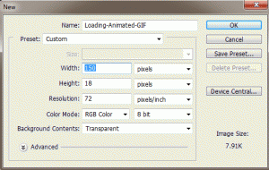
First, let’s open Adobe Photoshop and open a new document dimensions 150px by 18px. (See Figure 1).

Figure 1

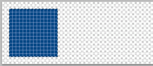
Then let’s select the Rectangular Marquee Tool in the tools panel, and at the top under Style select “Fixed Size” and enter the dimensions – Width: 14px Height: 14px. Then make a New Layer, and then click on the palette and position the square marquee to the left and centered (as seen in Figure 2). You may need to zoom in in order to position it exactly 2 pixels away from the edges so it is centered.

Figure 2

Then fill this selected square with your desired themed color, I chose a blue color (#044686), using the Paint Bucket Tool. (Also seen in Figure 2).

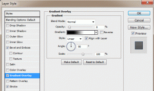
I like to apply a nice gradient to the square, as well as a little bevel and a clean border. First open the Layer Blending Options – do this by right clicking on the layer you placed the square on, and selecting “Blending Options…” or simply by double clicking the layer – and then go to Gradient Overlay. Then apply a slight gradient, I just keep it on Normal blending mode, and just lower the opacity to like 8%. (See Figure 3).

Figure 3

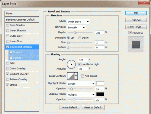
Then go to the Bevel and Emboss in the Layer Blending Options, and apply a slight bevel. This is accomplished by raising the Depth of the bevel and lowering the Opacity. I like the bevel to be small so I keep the size at 2px. Then I lower the opacity of the white to 15% and the black to 25%. (See Figure 4).

Figure 4

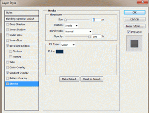
Now your square should have a nice gradient and bevel. To make it stand out from the background even more, add a nice clean border. Keep it at 1px width and either black or a darkened version of the color you used for the square. For example, my square is blue so I just used a dark blue (#0a2b4b). Do this by going to the Stroke menu in the Layer Blending Options. Enter the following for the properties: Size: 1px, Position: Inside, Opacity: 100%, and then choose your color. (See Figure 5).

Figure 5

Now your square has a Gradient, Bevel, and a nice Border. Now you can duplicate your square layer – select the layer and press (Ctrl+J) to make copies. After you make a copy, drag the squares you make to the right and keep them an equal distance from each other.  If you use the dimensions I did, you should be able to fit 8 squares in your document. (See Figure 6).

* I recommend using the guides in Photoshop to be sure they are an equal distance from one another. If rulers are not enabled, go to View > Rulers. Then drag guidelines from the left (vertical ruler) onto the document and use equal increments.

Figure 6

Once you have all your squares the way you want them and set equal distances from each other, you are ready to make the animation. Go the the top menu bar, and under Window select Animation. This will bring the animation menu below your document. To start you only want the first square visible, so hide all the other squares’ layers by clicking the Eyes to the left of each layer in the layers menu.

Your animation menu may come up in Timeline mode – this is shown as the title of the animation menu at the bottom. If it is called “Animation (Timeline)” then you are in timeline mode and you need to switch to frames mode. This is done by clicking the very small image in the bottom right corner of the animation menu which looks like a gray rectangle with 3 white squares in it. This will change the title to “Animation (Frames)“. Now, all you should see on your document is the first square, all the way to the left because we hid the others.

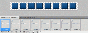
First, set the Delay to 0.5 seconds, this is done by clicking on the “10 sec.” with the down arrow. Now click the New Frame button (which looks identical to the new layer button but is located in the animation menu, obviously, not the layers menu). This will add a second frame to the animation. What you want to do is add a new frame, and then un-hide the next square in the sequence. So it’s basically: make a new frame and un-hide next square – over and over until you reach the last square in the document. When you are done, you should have 8 frames and 8 squares in the last frame. Lastly, set the looping to “Forever” by clicking where it says “Once” with a down arrow. (See Figure 7).

Figure 7

You can preview your animated loading image by zooming back out to 100% on the document, and going to Frame 1 and hit play. It’s still on a transparent background so it doesn’t look as nice as it will on your webpage, but just an idea. Here is our animated loading image:

Animated Loading GIF Image


Here is another, smoother sliding upload bar animated GIF I made:


Now that we have our animated loading GIF image, we need to incorporate this to our website with a form. Let’s say this is our form in HTML:

[codesyntax lang=”html4strict” title=”HTML Form”]
<form method=”post” action=”” enctype=”multipart/form-data”>
<table width=”650″ align=”center” border=”0″ cellpadding=”2″ cellspacing=”0″>
<tr>
<td align=”left” width=”100″><strong>Title:</strong></td>
<td align=”left”><input type=”text” name=”title” size=”25″ maxlength=”60″ /></td>
</tr>
<tr>
<td align=”left”><strong>Image:</strong></td>
<td align=”left”><input type=”file” name=”image” size=”25″ /></td>
</tr>
<tr>
<td align=”left” colspan=”2″><input type=”submit” value=”Submit” name=”submit” onclick=”showUploadDiv()” /></td>
</tr>
</table>
</form>
[/codesyntax]

So right now, this form just submits as normal without any loading image. To change this, we use the “onclick” attribute to the submit button, so that once the submit button is clicked (the form is submitted) we will display the loading image with whatever text we want to go along with it. So first let’s make some CSS styles for the uploading div and the image itself, then some Javascript entries, to the <head> portion of the webpage.

Insert the following in the <head></head> section:

[codesyntax lang=”css” title=”CSS Styles and IDs”]
<style type=”text/css”>
#uploading {
background: #eee;
padding: 3px;
border: 1px dashed #ccc;
width: 300px;
text-align:center;
}
#loading_image {
width:100%;
height:18px;
border:0;
padding: 2px 0;
background: #eee url(./Loading-Animated-GIF.gif) no-repeat top center;
text-align: center;
}
</style>
[/codesyntax]

[codesyntax lang=”javascript” title=”Show Upload Image JavaScript Function”]
<script type=”text/javascript”>
function showUploadDiv(){
var uploadDiv = document.getElementById(‘uploading’);
if(uploadDiv.style.display == ‘none’){
// the div isnt being displayed yet, so lets change the display then write the content
uploadDiv.style.display = ‘block’;
uploadDiv.innerHTML = ‘Please wait while your image is being uploaded…<br/><div id=”loading_image”></div>’;
}
}
</script>
[/codesyntax]

Now, right after our form we need to include a <div> which holds the uploading animated GIF and some text. So let’s put this right after the form:

[codesyntax lang=”html4strict” title=”Uploading DIV”]
<div id=”uploading” style=”display:none”>
</div>
[/codesyntax]

Be sure to change the image source to your images location and file name so it loads properly. Otherwise you will see the alternative text. Now, we have one last change to make. We need to add the onclick function to the form’s submit button. So let’s go back to the form and change the submit button to the following:

[codesyntax lang=”html4strict” title=”Form Submit Button”]
<input type=”submit” value=”Submit” name=”submit” onclick=”showUploadDiv()” />
[/codesyntax]

Now when we click the submit button we will see a nice message letting us know our image is being uploaded and an image representing the upload progress.

Click here to check out the demo!

Enjoy!

Filed under: Tutorials, Web ProgrammingTagged with: , , , , , , , , , , , ,

HTML Div Float Property

Div Float LayoutUsing the HTML tag – <div> and the float style property, you can make designs for your websites. Well, you can make layouts for where design could be. This is a good structural tool in laying out where content will be on your web pages, images, blurbs, etc.

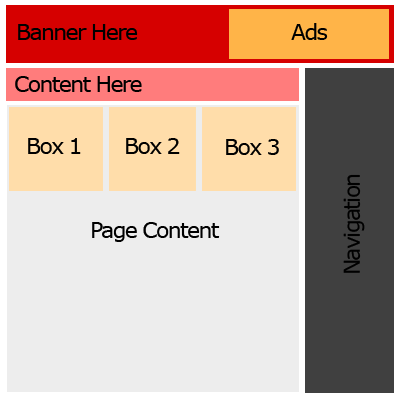
Let’s say we want a page to look like this:

First I’m going to set up the CSS styles we will set our <div>’s to in the HTML to give this page the right look as far as padding, margins, borders, etc. Once we have all the styles defined we will call them to the DIV tags in our HTML like so: <div class=”CLASSNAME“>. Using the right float’s in the right order will place our DIVs in the right places to make this layout.

This will go in our <head> tags of the HTML page:

[code lang=”css”]
html, body, center {
padding: 0px;
margin: 0px;
height: 100%;
}
.header {
padding: 8px;
vertical-align: middle;
height: 80px;
background: #d60000;
}
.banner {
float: left;
border: 0;
vertical-align: middle;
width: 500px;
height: 60px;
}
.ads {
padding: 10px 0px;
float: right;
width: 300px;
height: 60px;
vertical-align: middle;
background: #ffb448;
}
.wrapper { /* Main page holder. */
padding: 10px;
width: 875px;
background: #fff;
height: 100%;
}
.page {
padding: 10px 0px;
width: 630px;
float: left;
height: 100%;
}
.top {
padding: 5px;
height: 40px;
background: #ff7c7c;
margin:0;
}
#boxes {
padding: 5px 0px;
}
.box {
width: 197px;
height: 197px;
padding: 3px;
margin: 3px;
background: #ffddaa;
float: right;
}
.rightside {
float: right;
text-align: center;
height: 100%;
padding: 10px 0px;
}
.nav {
padding: 5px;
background: #ccc;
width: 200px;
height: 100%;
min-height: 600px;
}
.content {
margin: 20px 0px;
width: 600px;
text-align: left;
}
[/code]

Now we have to write the HTML to use these styles appropriately.

Here is our <body> HTML:

[code lang=”html”]


Ads Here
Content Here
Box 3
Box 2
Box 1

Content Here, lots and lots of content here! Content Here, lots and lots of content here! Content Here, lots and lots of content here! Content Here, lots and lots of content here! Content Here, lots and lots of content here! Content Here, lots and lots of content here! Content Here, lots and lots of content here! Content Here, lots and lots of content here!Content Here, lots and lots of content here!

Content Here, lots and lots of content here!Content Here, lots and lots of content here!Content Here, lots and lots of content here!Content Here, lots and lots of content here!Content Here, lots and lots of content here!

[/code]

Take a look at the HTML in action here!

If you notice in the HTML the box’s are placed in descending order inside the “boxes” div ID. Since the box class is set to to the right:

[code lang=”css”]
.box {
float: right;
}
[/code]

We put the boxes in descending order so that the HTML will read down the page and float the first one to the right, then the next, then the last. So it floats BOX3, then BOX2, then BOX1.

Using the float style property of DIV tags is really useful in making layouts because it does not require any real guidelines to follow as far as where it is on the page. This sounds a little wordy but basically with a combination of float, and position style attributes you can make your DIV’s go where ever you want.

Filed under: HTML, Tutorials, Web Programming, XHTMLTagged with: , , , , , , ,

CSS Drop-Down Menu

Drop down menus are very useful for navigation on websites and for holding many links to pages on your site without taking up much space on your web pages. Using just CSS and Javascript we can make a nice simple drop down menu you can put on your web page. To do this we’ll have three files: dropdown.css, dropdown.js, and index.html. Our index.html page will display the drop down menu and our stylesheet – dropdown.css – will hold the styles for the drop down menu.

Here is a preview of what our drop down menu will look like:

Dropdown.css

[codesyntax lang=”css” title=”Dropdown Stylesheet”]
@charset “utf-8”;
#dropdown {
margin: 0px;
padding: 0px;
list-style-type: none;
text-align: left;
font: 11px Arial, Helvetica, sans-serif;
}
#dropdown li {
float: left;
margin: 0px;
padding: 5px;
list-style-type: none;
border-bottom: 2px solid #cccccc;
border-right: 1px solid #eeeeee;
}
#dropdown li a {
display: block;
margin: 0;
text-decoration: none;
}

#dropdown div {
position: absolute;
visibility: hidden;
margin: 7px 0px 0px 0px;
padding: 0;
background-color: #e8e8e8;
border-right: 1px solid #c5c5c5;
border-bottom: 1px solid #c5c5c5;
}
#dropdown div a {
position: relative;
display: block;
margin: 0;
padding: 3px 6px;
width: auto;
white-space: nowrap;
text-align: left;
text-decoration: none;
font: 11px Verdana, Arial, Helvetica, sans-serif;
color: #333;
border-top: 1px solid #f1f1f1;
border-bottom: 1px solid #e2e2e2;
}
#dropdown div a:hover {
background-color: #f1f1f1;
color: #000;
}
[/codesyntax]

Dropdown.js

[codesyntax lang=”html4strict” title=”Javascript Source Code”]
// Dropdown menu javascript
var timeout    = 500;
var closetimer    = 0;
var ddmenuitem    = 0;

// open hidden layer
function mopen(id)
{
// cancel close timer
mcancelclosetime();

// close old layer
if(ddmenuitem) ddmenuitem.style.visibility = ‘hidden’;

// get new layer and show it
ddmenuitem = document.getElementById(id);
ddmenuitem.style.visibility = ‘visible’;

}
// close showed layer
function mclose()
{
if(ddmenuitem) ddmenuitem.style.visibility = ‘hidden’;
}

// go close timer
function mclosetime()
{
closetimer = window.setTimeout(mclose, timeout);
}

// cancel close timer
function mcancelclosetime()
{
if(closetimer)
{
window.clearTimeout(closetimer);
closetimer = null;
}
}

// close layer when click-out
document.onclick = mclose;
[/codesyntax]

Index.html

[codesyntax lang=”html4strict” title=”Index HTML”]
<!DOCTYPE html PUBLIC “-//W3C//DTD XHTML 1.0 Transitional//EN” “http://www.w3.org/TR/xhtml1/DTD/xhtml1-transitional.dtd”>
<html xmlns=”http://www.w3.org/1999/xhtml”>
<head>
<meta http-equiv=”Content-Type” content=”text/html; charset=utf-8″ />
<title>Untitled Document</title>
<link href=”./dropdown.css” rel=”stylesheet” type=”text/css” />
<script type=”text/javascript” src=”./dropdown.js”></script>
</head>

<body>
<ul id=”dropdown”>
<li><a href=”#”>Homepage</a></li>
<li><a href=”#” onmouseover=”mopen(‘list1’)” onmouseout=”mclosetime()”>Drop Down Menu #1</a>
<div id=”list1″ onmouseover=”mcancelclosetime()” onmouseout=”mclosetime()”>
<a href=”#”>Drop Down Link #1</a>
<a href=”#”>Drop Down Link #2</a>
<a href=”#”>Drop Down Link #3</a>
</div>
</li>
<li><a href=”#” onmouseover=”mopen(‘list2’)” onmouseout=”mclosetime()”>Drop Down Menu #2</a>
<div id=”list2″ onmouseover=”mcancelclosetime()” onmouseout=”mclosetime()”>
<a href=”#”>Drop Down Link #1</a>
<a href=”#”>Drop Down Link #2</a>
<a href=”#”>Drop Down Link #3</a>
</div>
</li>
<li><a href=”#”>Link #1</a></li>
<li><a href=”#”>Link #2</a></li>
<li><a href=”#” onmouseover=”mopen(‘list3’)” onmouseout=”mclosetime()”>Drop Down Menu #3</a>
<div id=”list3″ onmouseover=”mcancelclosetime()” onmouseout=”mclosetime()”>
<a href=”#”>Drop Down Link #1</a>
<a href=”#”>Drop Down Link #2</a>
<a href=”#”>Drop Down Link #3</a>
</div>
</li>
</ul>
</body>
</html>
[/codesyntax]

Click here to view the live demo!

Click here to download this drop down menu script!

Filed under: CSS, Scripts, TutorialsTagged with: ,

Making a CSS Linkbar with Photoshop

In this post I am going to show you how to make a cool link bar for your website with Photoshop. Link bars are very important in websites as they provide a clear and easy way for viewers to reach other pages on your site. Basically we’ll make a background image which will be set to repeat along the x axis as the background of the cells in our table. Then the links in the link bar will be placed on top of the background image blending in nicely as the buttons on your link bar.

In CSS we make a few styles for the table that will serve as the link bar holder:

style.css

[code lang=”css”]
.link-bar {
padding:0;
border: 2px solid #d8d8d8;
font: 11px tahoma;
}
.link-bar td {
background: #eee url(./images/bg.gif) repeat-x top left;
padding:0;
height: 32px;
}
[/code]

On our server we have to be sure to be placing the images all in the “images” folder in the “public_html” folder – your website’s default directory.

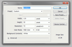
I made a new document with the dimensions 110×32 pixels as the size of a button. You can make them as big as you want for different words or a standard size, whatever you prefer.

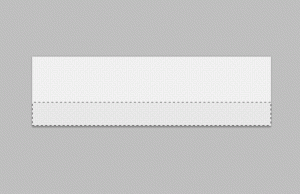
1. Make a new layer and fill the layer with the color #EEEEEE as the background color of the link bar.

2. Make another layer and select a lower smaller half portion of the button to shade in with #E5E5E5.

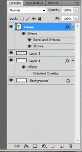
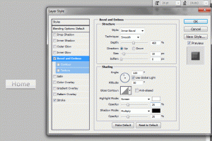
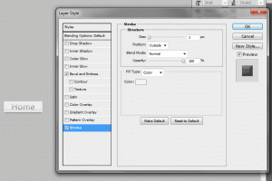
3. Then make your text layer by typing whatever you want onto the canvas with the text tool on the tool panel. I started with “Home” as the first button. You want to apply the following settings to the text layer’s blending options. You can do this by double clicking on the text layer in the layers panel.

Double click the “Home” text layer and apply the settings below or something similar. You can change these grayscale colors to whatever you would like to fit your website’s color theme.

Our first button turns out something as so:

Now, you can make a rollover image if you would like. This will just make the image change when the viewer puts their cursor over it. We’ll add a slight glow on a new layer to make a rollover layer.

Optional Rollover Image Changes

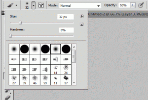
4. Make a new layer. Select the brush tool in the tools panel. Select the 5th brush type, a glowy brush. Set the size to something like 32px and turn the opacity to 50%. Select the color white (#FFFFFF). Here are the settings:

5. At the top of the image drag half of the brush over the very top of the image and the other half off the canvas to make a slight white glow at the top of the image. Here is the result magnified:

Now as the background all we have to do is make a new document with dimensions 1×32. This will be a single line that will repeat as the background. Now do the same you did to the background of the buttons. Make a layer filled in as #EEEEEE and then another layer with 11 pixels or however much you selected along the bottom as #E5E5E5. Here is the background image close up:

Now as the seperator to the images we need to make a seperator image. This will be a very thin image that will sit between the buttons to give them some distinction.

6. Make a new document 2×32 pixels. On one layer copy the background image we made before and stretch it to be 2 pixels wide. (Press Ctrl+T to transform the layer). Make a new layer and fill the middle left half of the image with the color #DADADA and the middle right half with #F6F6F6. Here is the fill-in’s up close:

Now we have our links and our background image. You will need to make a rollover image for every button you want to have one. Now we just have to apply the CSS styles above to our table that will have the link bar images in it. We do this by setting the link tag in the <head> HTML tags.

Insert the following code in the <head> tags:

[code lang=”html”] [/code]

Here is our HTML:

[code lang=”html”]

[/code]

This will produce something like so:

Filed under: CSS, Graphics, TutorialsTagged with: , ,