When you have a form to submit some kind of data to your website it is very helpful to have a loading image that is displayed once the user submits the form.
This let’s the user know that the form was submitted and the upload is in progress, rather than just relying on looking up at the address bar and seeing the refresh button spinning. This also helps prevent people from clicking the submit button again, causing problems with the upload, ending in the user being frustrated and leaving.
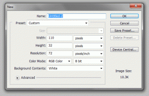
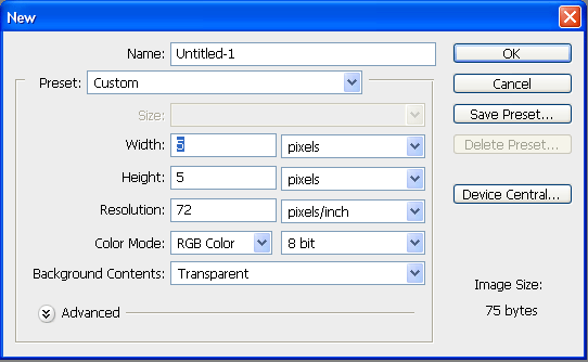
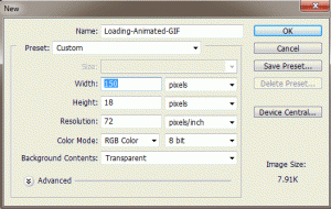
First, let’s open Adobe Photoshop and open a new document dimensions 150px by 18px. (See Figure 1).
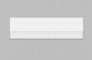
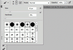
Then let’s select the Rectangular Marquee Tool in the tools panel, and at the top under Style select “Fixed Size” and enter the dimensions – Width: 14px Height: 14px. Then make a New Layer, and then click on the palette and position the square marquee to the left and centered (as seen in Figure 2). You may need to zoom in in order to position it exactly 2 pixels away from the edges so it is centered.
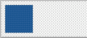
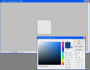
Then fill this selected square with your desired themed color, I chose a blue color (#044686), using the Paint Bucket Tool. (Also seen in Figure 2).
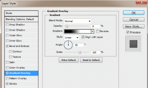
I like to apply a nice gradient to the square, as well as a little bevel and a clean border. First open the Layer Blending Options – do this by right clicking on the layer you placed the square on, and selecting “Blending Options…” or simply by double clicking the layer – and then go to Gradient Overlay. Then apply a slight gradient, I just keep it on Normal blending mode, and just lower the opacity to like 8%. (See Figure 3).
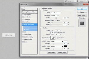
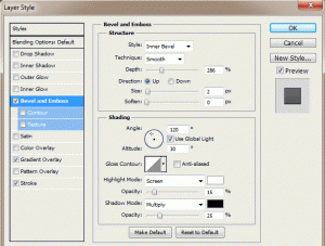
Then go to the Bevel and Emboss in the Layer Blending Options, and apply a slight bevel. This is accomplished by raising the Depth of the bevel and lowering the Opacity. I like the bevel to be small so I keep the size at 2px. Then I lower the opacity of the white to 15% and the black to 25%. (See Figure 4).
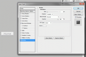
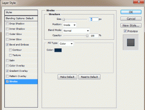
Now your square should have a nice gradient and bevel. To make it stand out from the background even more, add a nice clean border. Keep it at 1px width and either black or a darkened version of the color you used for the square. For example, my square is blue so I just used a dark blue (#0a2b4b). Do this by going to the Stroke menu in the Layer Blending Options. Enter the following for the properties: Size: 1px, Position: Inside, Opacity: 100%, and then choose your color. (See Figure 5).
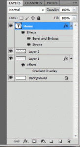
Now your square has a Gradient, Bevel, and a nice Border. Now you can duplicate your square layer – select the layer and press (Ctrl+J) to make copies. After you make a copy, drag the squares you make to the right and keep them an equal distance from each other. If you use the dimensions I did, you should be able to fit 8 squares in your document. (See Figure 6).
* I recommend using the guides in Photoshop to be sure they are an equal distance from one another. If rulers are not enabled, go to View > Rulers. Then drag guidelines from the left (vertical ruler) onto the document and use equal increments.

Once you have all your squares the way you want them and set equal distances from each other, you are ready to make the animation. Go the the top menu bar, and under Window select Animation. This will bring the animation menu below your document. To start you only want the first square visible, so hide all the other squares’ layers by clicking the Eyes to the left of each layer in the layers menu.
Your animation menu may come up in Timeline mode – this is shown as the title of the animation menu at the bottom. If it is called “Animation (Timeline)” then you are in timeline mode and you need to switch to frames mode. This is done by clicking the very small image in the bottom right corner of the animation menu which looks like a gray rectangle with 3 white squares in it. This will change the title to “Animation (Frames)“. Now, all you should see on your document is the first square, all the way to the left because we hid the others.
First, set the Delay to 0.5 seconds, this is done by clicking on the “10 sec.” with the down arrow. Now click the New Frame button (which looks identical to the new layer button but is located in the animation menu, obviously, not the layers menu). This will add a second frame to the animation. What you want to do is add a new frame, and then un-hide the next square in the sequence. So it’s basically: make a new frame and un-hide next square – over and over until you reach the last square in the document. When you are done, you should have 8 frames and 8 squares in the last frame. Lastly, set the looping to “Forever” by clicking where it says “Once” with a down arrow. (See Figure 7).
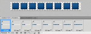
You can preview your animated loading image by zooming back out to 100% on the document, and going to Frame 1 and hit play. It’s still on a transparent background so it doesn’t look as nice as it will on your webpage, but just an idea. Here is our animated loading image:
Here is another, smoother sliding upload bar animated GIF I made:
Now that we have our animated loading GIF image, we need to incorporate this to our website with a form. Let’s say this is our form in HTML:
[codesyntax lang=”html4strict” title=”HTML Form”]
<form method=”post” action=”” enctype=”multipart/form-data”>
<table width=”650″ align=”center” border=”0″ cellpadding=”2″ cellspacing=”0″>
<tr>
<td align=”left” width=”100″><strong>Title:</strong></td>
<td align=”left”><input type=”text” name=”title” size=”25″ maxlength=”60″ /></td>
</tr>
<tr>
<td align=”left”><strong>Image:</strong></td>
<td align=”left”><input type=”file” name=”image” size=”25″ /></td>
</tr>
<tr>
<td align=”left” colspan=”2″><input type=”submit” value=”Submit” name=”submit” onclick=”showUploadDiv()” /></td>
</tr>
</table>
</form>
[/codesyntax]
So right now, this form just submits as normal without any loading image. To change this, we use the “onclick” attribute to the submit button, so that once the submit button is clicked (the form is submitted) we will display the loading image with whatever text we want to go along with it. So first let’s make some CSS styles for the uploading div and the image itself, then some Javascript entries, to the <head> portion of the webpage.
Insert the following in the <head></head> section:
[codesyntax lang=”css” title=”CSS Styles and IDs”]
<style type=”text/css”>
#uploading {
background: #eee;
padding: 3px;
border: 1px dashed #ccc;
width: 300px;
text-align:center;
}
#loading_image {
width:100%;
height:18px;
border:0;
padding: 2px 0;
background: #eee url(./Loading-Animated-GIF.gif) no-repeat top center;
text-align: center;
}
</style>
[/codesyntax]
[codesyntax lang=”javascript” title=”Show Upload Image JavaScript Function”]
<script type=”text/javascript”>
function showUploadDiv(){
var uploadDiv = document.getElementById(‘uploading’);
if(uploadDiv.style.display == ‘none’){
// the div isnt being displayed yet, so lets change the display then write the content
uploadDiv.style.display = ‘block’;
uploadDiv.innerHTML = ‘Please wait while your image is being uploaded…<br/><div id=”loading_image”></div>’;
}
}
</script>
[/codesyntax]
Now, right after our form we need to include a <div> which holds the uploading animated GIF and some text. So let’s put this right after the form:
[codesyntax lang=”html4strict” title=”Uploading DIV”]
<div id=”uploading” style=”display:none”>
</div>
[/codesyntax]
Be sure to change the image source to your images location and file name so it loads properly. Otherwise you will see the alternative text. Now, we have one last change to make. We need to add the onclick function to the form’s submit button. So let’s go back to the form and change the submit button to the following:
[codesyntax lang=”html4strict” title=”Form Submit Button”]
<input type=”submit” value=”Submit” name=”submit” onclick=”showUploadDiv()” />
[/codesyntax]
Now when we click the submit button we will see a nice message letting us know our image is being uploaded and an image representing the upload progress.
Click here to check out the demo!
Enjoy!
