In this post I am going to show you how to make a cool link bar for your website with Photoshop. Link bars are very important in websites as they provide a clear and easy way for viewers to reach other pages on your site. Basically we’ll make a background image which will be set to repeat along the x axis as the background of the cells in our table. Then the links in the link bar will be placed on top of the background image blending in nicely as the buttons on your link bar.
In CSS we make a few styles for the table that will serve as the link bar holder:
style.css
[code lang=”css”]
.link-bar {
padding:0;
border: 2px solid #d8d8d8;
font: 11px tahoma;
}
.link-bar td {
background: #eee url(./images/bg.gif) repeat-x top left;
padding:0;
height: 32px;
}
[/code]
On our server we have to be sure to be placing the images all in the “images” folder in the “public_html” folder – your website’s default directory.
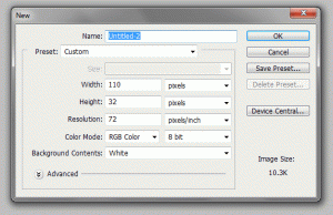
I made a new document with the dimensions 110×32 pixels as the size of a button. You can make them as big as you want for different words or a standard size, whatever you prefer.
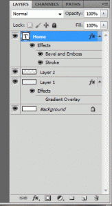
1. Make a new layer and fill the layer with the color #EEEEEE as the background color of the link bar.
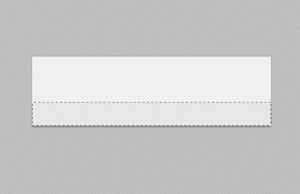
2. Make another layer and select a lower smaller half portion of the button to shade in with #E5E5E5.
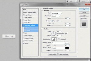
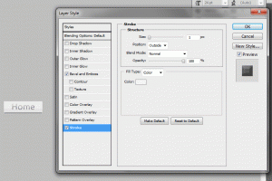
3. Then make your text layer by typing whatever you want onto the canvas with the text tool on the tool panel. I started with “Home” as the first button. You want to apply the following settings to the text layer’s blending options. You can do this by double clicking on the text layer in the layers panel.
Double click the “Home” text layer and apply the settings below or something similar. You can change these grayscale colors to whatever you would like to fit your website’s color theme.
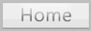
Our first button turns out something as so:
Now, you can make a rollover image if you would like. This will just make the image change when the viewer puts their cursor over it. We’ll add a slight glow on a new layer to make a rollover layer.
Optional Rollover Image Changes
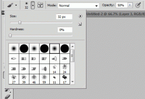
4. Make a new layer. Select the brush tool in the tools panel. Select the 5th brush type, a glowy brush. Set the size to something like 32px and turn the opacity to 50%. Select the color white (#FFFFFF). Here are the settings:
5. At the top of the image drag half of the brush over the very top of the image and the other half off the canvas to make a slight white glow at the top of the image. Here is the result magnified:
Now as the background all we have to do is make a new document with dimensions 1×32. This will be a single line that will repeat as the background. Now do the same you did to the background of the buttons. Make a layer filled in as #EEEEEE and then another layer with 11 pixels or however much you selected along the bottom as #E5E5E5. Here is the background image close up:
Now as the seperator to the images we need to make a seperator image. This will be a very thin image that will sit between the buttons to give them some distinction.
6. Make a new document 2×32 pixels. On one layer copy the background image we made before and stretch it to be 2 pixels wide. (Press Ctrl+T to transform the layer). Make a new layer and fill the middle left half of the image with the color #DADADA and the middle right half with #F6F6F6. Here is the fill-in’s up close:
Now we have our links and our background image. You will need to make a rollover image for every button you want to have one. Now we just have to apply the CSS styles above to our table that will have the link bar images in it. We do this by setting the link tag in the <head> HTML tags.
Insert the following code in the <head> tags:
[code lang=”html”] [/code]
Here is our HTML:
[code lang=”html”]
 |
 |
 |
 |
 |
[/code]
This will produce something like so:
 |
 |
 |
 |
 |
